Problem:
Ever since I was a child, I’ve been fascinated by the shapes of letters. How can a letter take on so many different appearances and still be the same thing? When I walk through the city I always notice the typography of signs and advertisements and I wonder why the messages that stand out have the power that they do. I guess you could say my interest in typography is an itch and over time it needed scratching.
Action:
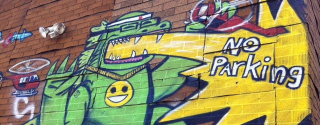
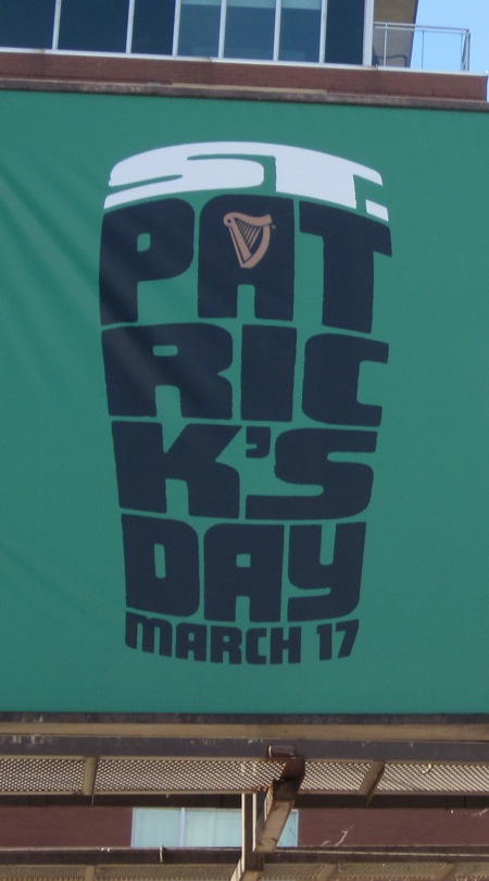
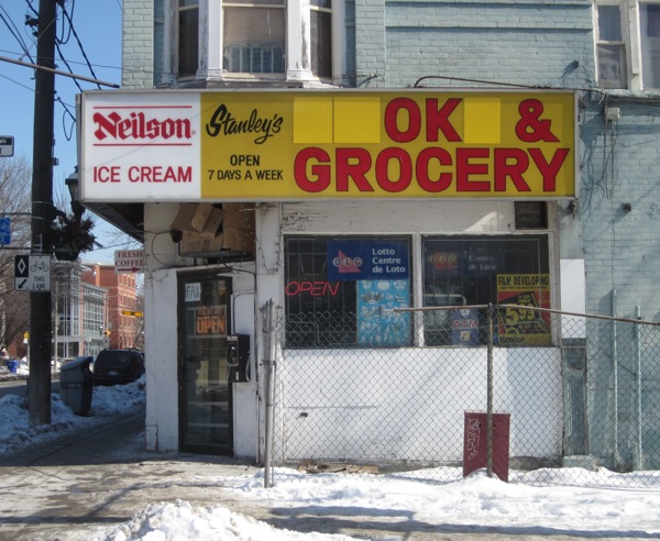
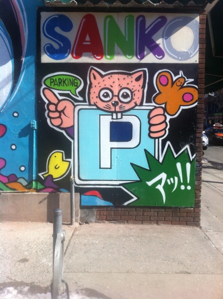
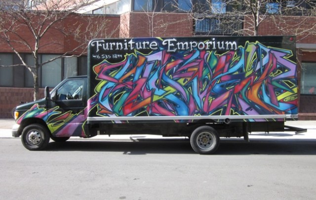
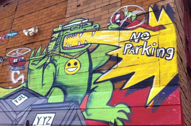
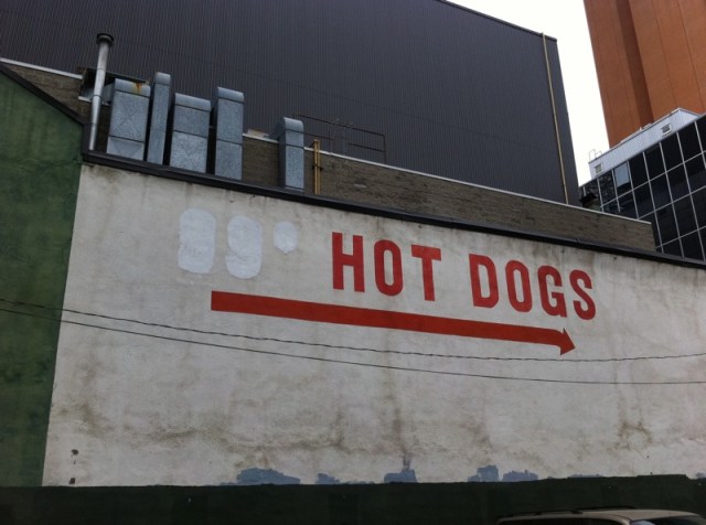
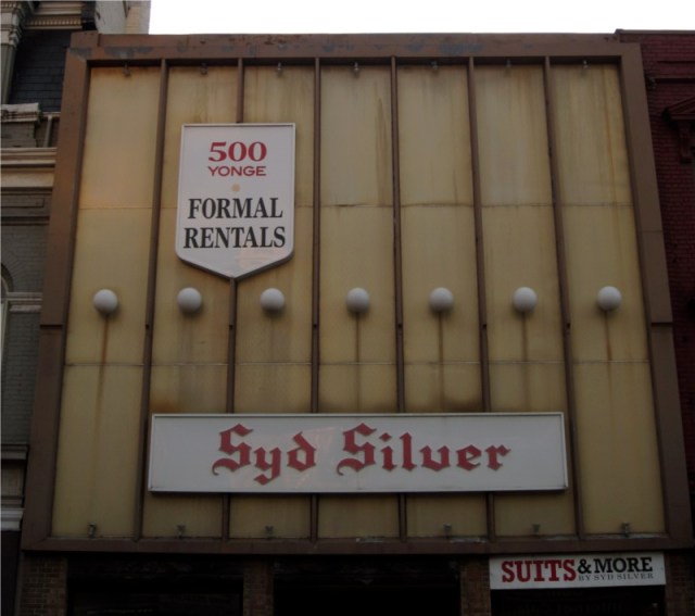
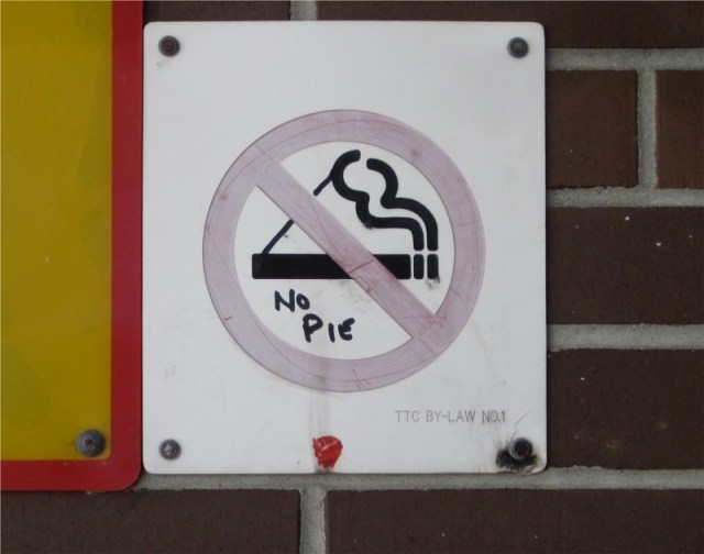
I decided to conduct an independent research project. On my journeys through Toronto I’d snap pictures of the signs and ads that really made me stop and stare. Then in 100 words or less I’d try to capture what it was that grabbed my attention. I posted the results online.
I had no idea how long the project would last. In the end, it went on for six years. Here are just a few of the photos I took. (Clicking on an image will open up the original post in a new window.)

Result:
The itch still hasn’t gone away, but the project was satisfying, leaving me with a new appreciation of how the endlessly variable nature of letterforms can capture the eye.
The entire archive of the project, around 180 posts, is still online:
Want to create digital products your customers will love? Contact Corneil now!
